Learning your Watercolor Color Palette
How to know each color in your travel palette.
T ravel paint palettes get messy real fast. When I close my palette up after using it, excess water swishes about inside, applying a film of gray and brown over each color.
On top of that, I never remember exactly which shade of blue is which, and which shade of yellow or orange or even sienna is which.
This becomes more of a problem while travel sketching, because I need to paint quickly, without testing color on a swatch.
I've slowly learned that the precise name of the pigment you are using, and even the brand, is important to know, especially when you are traveling and have just a small timeframe (and small, uncomfortable spaces) to paint. Often, you don't even have time to mix paint. You need to get it done with a single color.

I reference a smartphone photo to quickly find colors
I need while sketching on the road. I like using large waterpoof palettes, as I can open them up, get them wet and not worry too much about them leaking in the rest of my gear. Check out this palette by Martin Mijello.
In fact, memorizing the position of certain keystone colors is tremendously helpful while traveling. I've finally resolved this problem by doing this:
Label your pigments - use strips of sticky notes, masking tape or even place the palette on a grocery bag, and write the names of each pigment outside the palette. Take a smartphone photo of the palette, and keep the photo handy, either by printing it and taping it to the back of your palette, or just keeping the photo saved on your phone.
Best Colors for a Travel Watercolor Palette
Below are a few colors which could easily be mistaken for other colors in a palette. I give my reasons for needing each of these exact pigments, and why its important for me to label and memorize them. For me, these are the best, most essential pigments in my watercolor palette.
Cobalt Turquoise
Winsor & Newton's Cobalt Turquoise is the color of shallow seas. This is my go-to shade for shallow water on maps. It mixes vibrantly with just about any blue or green, and I use it as a base for both water and dark jungle. Link to Cobalt Turquoise
Pthalo Blue
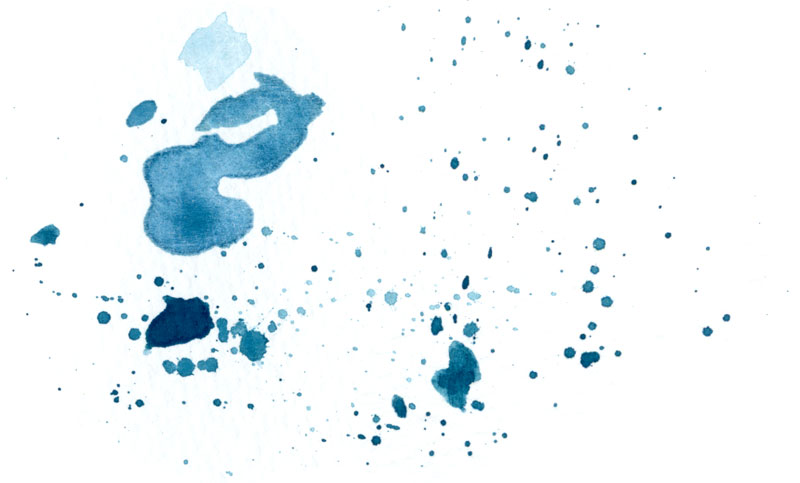
There is really no replacement for this synthetic, chemical blue, which is sometimes called Helio Blue or Winsor Blue. It turns paper into vivid, daytime skies, immeasurably important in so many travel sketches.
Pthalo blue is often considered too intense and overpowering for many realistic paintings, but when you need to lay down color quickly while sketching on the side of a road or in a cafe, that surreal sky comes in handy. Link to Pthalo Blue

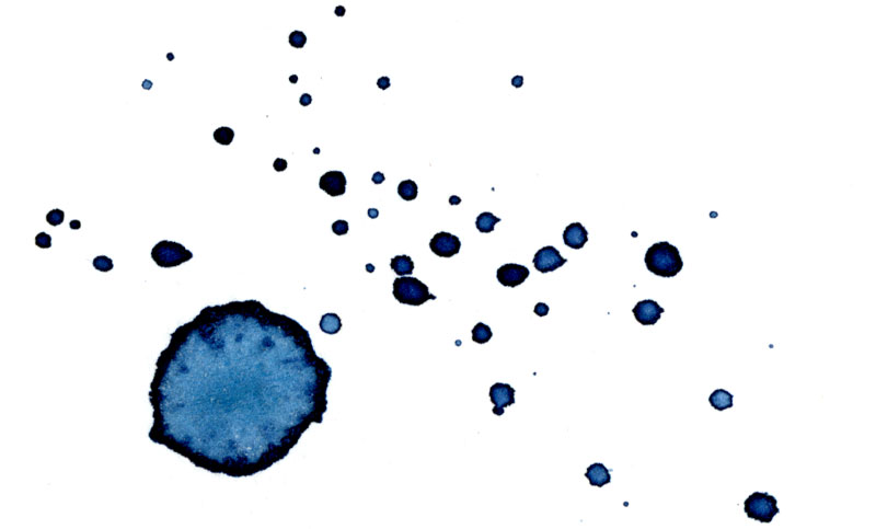
Indigo
If I had just one watercolor shade in my palette, this historical pigment, discovered in different cultures around the world, would be it. In fact, travel sketches with black liner pen and indigo watercolor look great. My Winsor & Newton Indigo is used for so many different travel sketching purposes, and I never tire of this versatile midnight blue, which can laid down dark and intense, or soft and pale. I use it to represent black, by adding burnt sienna, and I use it for shadows, and the edge of oceans. There is something about this specific pigment against white paper that is uniquely clean and crisp. Link to Indigo
Cadmium Orange
Another pigment that can be confused for others in the palette, but which has such unique characteristics of its own, is Cadmium Orange.
You can see in the example how many different tints and shades this single pigment can produce. This is why cadmium orange is so useful on the road. A few swipes of the brush produces rich and varied orange and yellow textures. Link to Cadmium Orange


Pthalo Turquoise
This is a singular color. There is nothing like it at all. When my brush goes for this pigment, it's going big. Imagine a dark turquoise, that can be glazed into an almost-black. Sometimes it feels blue, but mostly, it's a vibrant, dark turquoise, the color of jungle leaves in the early morning. Link to Pthalo Turquoise
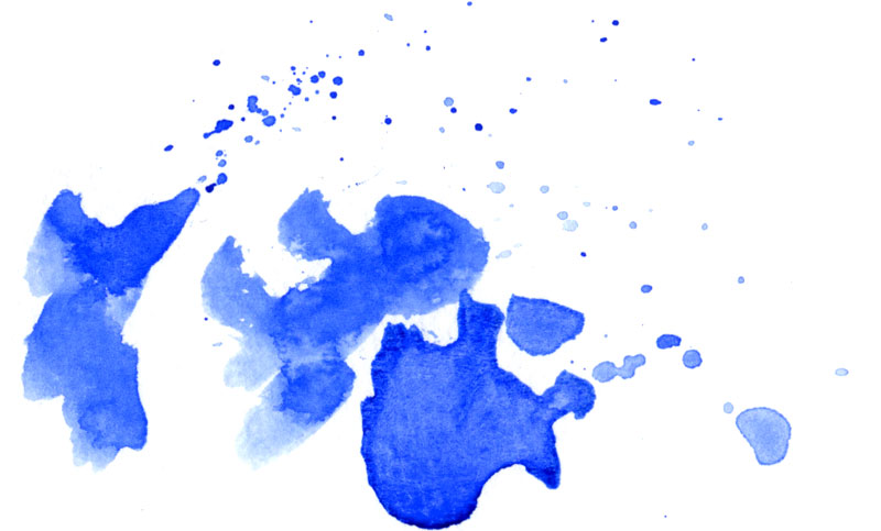
Ultramarine
Ultramarine defines the deep blue of the distant sea on a sunny day. But it also takes on different characteristics on paper, from gentle and light to deep and pure. Link to Ultramarine Blue

Quinacridone Violet
This is another spectacular and vivid hue, that works so well in travel sketches. I love this pigment for the way it transforms from deep violets to airy magentas. Bougainvillea, rainy streets at night. Link to Quinacridone Violet
Winsor Violet
This brilliant bluish-purple, sometimes called dioxazine purple, actually shows up in nature all the time. This paint is loaded with pigment. You can see in the example how you can almost create a black out of this intense violet. Deep marine hues, evening skies, and a great color to represent many Latin American bird species. Link to Winsor Violet


French Ultramarine
French ultramarine looks exactly like ultramarine in the palette, and the two shades are often difficult to tell apart on the paper. But french ultramarine lays down on the paper in a different way; it has a more pure, soft quality to it, and so I like to use it for afternoon sky. Link to French Ultramarine