
From Travel Palette to Studio Watercolor Palette
Twenty-five years of sketching from a waterproof travel tin, and the year I finally gave 99 pigments a permanent home — three porcelain palettes and a laminated map.
Updated September 25, 2026
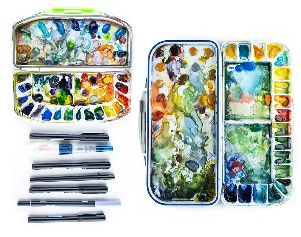
For most of the past twenty-five years, I've painted the same way I traveled: light.
My watercolor kit has always been inside a waterproof travel palette. The same one I purchased in 2002. Eventually I added a second, smaller watercolor palette with smaller wells, to shave more weight off an already lightweight system. I have never been much of a watercolor artist and never learned proper wet-on-wet painting. My goal was always rough field sketches.
That approach worked for me and continues to work for me when I'm traveling. A box of watercolors, a waterbrush, a few liner pens.
But this year, some new travel projects demanded colors I had never needed before. Buff Titanium for pale volcanic cliffs. Cobalt Green Turquoise for tropical shallows.
This year, I needed more control over my pigments as I began to mix colors just a little more intentionally.
And my trusty travel palettes started to work against me.
My Two Messy Travel Palettes
My travel palettes evolved over years rather than being designed.
Whenever I bought a new tube of paint, I squeezed it into whatever empty well happened to be available. Sometimes I'd scrape out a color I wasn't using. Other times I'd squeeze a new pigment into one of the large mixing wells.
Over time, I tried to develop a mental map of where everything lived. I even created a label system for the palette and wrote about it here.
But as the number of pigments grew, that system broke down. Dried watercolor has a habit of disguising itself. Blues look black and deep greens look identical to Payne's Gray. Several earth pigments become nearly impossible to distinguish once dry.
More than once I'd wet the wrong color, which can be a problem if you're watercoloring in the passenger seat of a moving car.
The problem wasn't the paint. It was my system of organization.
Building a Permanent Studio Palette
Eventually, I admitted that I needed to make a change that I had been resisting for years. I needed a permanent studio watercolor palette in order to accomplish some of my new projects this year. Every pigment has to have a permanent home, and I need a labeling system that I can reference easily, and easily change when I add a color or change the well locations of certain pigments.
The only way to do it, I realized, is to take a photo of my palette after I've mapped out where the pigments should lay.
I realized I needed two large porcelain palettes to hold the approximately 60 pigments I had collected over the years. I ended up buying two identical MEEDEN 33-well watercolor palettes.
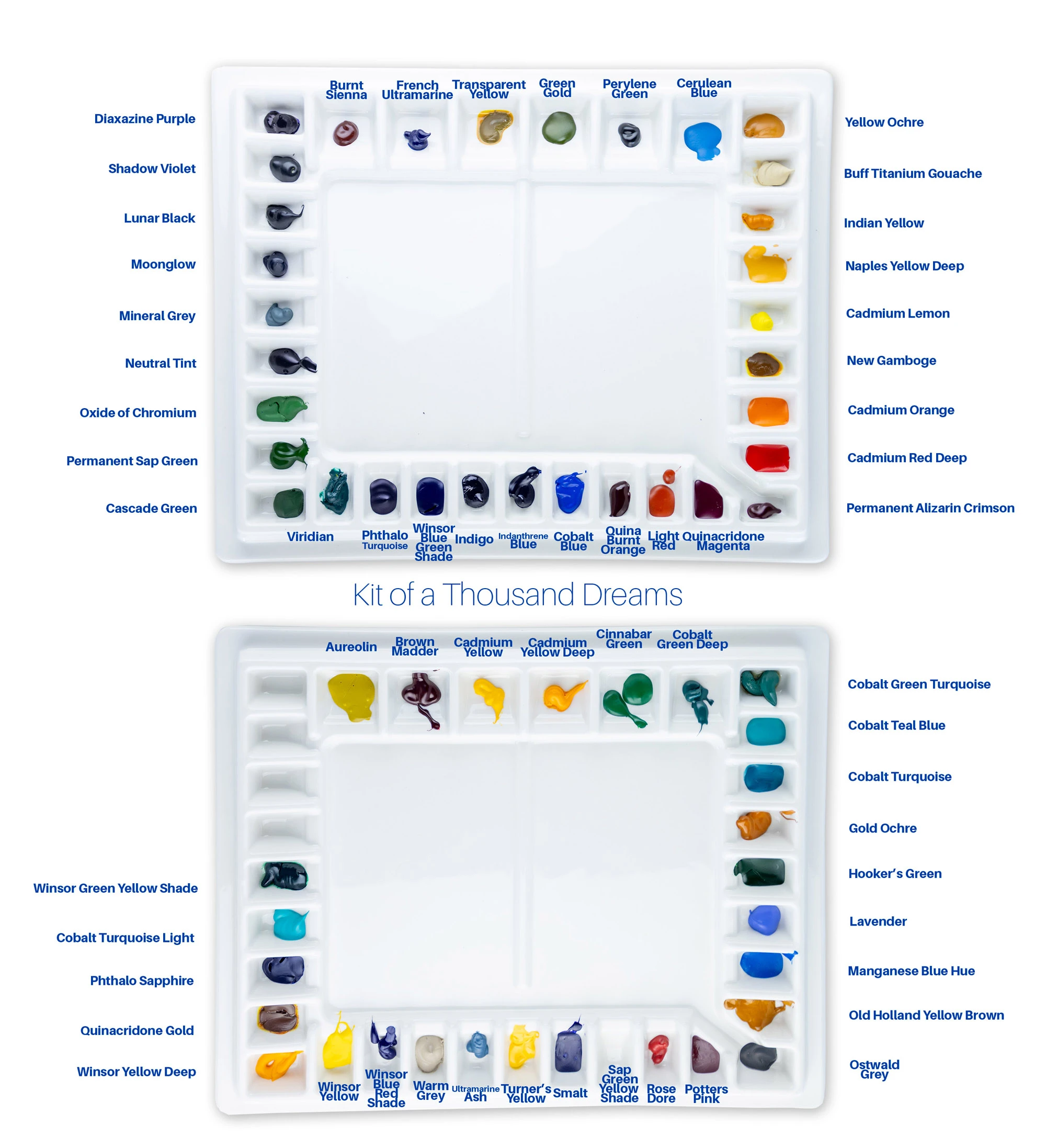
The two studio palettes, mapped out before the first brush touched them: the Field Kit of everyday earth colors, Mediterranean blues and dependable mixers, and the Kit of a Thousand Dreams for the specialty pigments.
The first palette I call "Field Kit" because it's meant to imitate the colors I most need in my travel kit. These are the colors I reach for constantly: earth colors, Mediterranean blues, travel greens, and dependable mixing pigments. The colors I use most sit in the largest wells.
The second palette is what I call my "Kit of a Thousand Dreams."
These are the weird specialty pigments that don't often get used but become indispensable when they do. It also holds the pigments I bought in ignorance when I was trying to find colors that would have been better created by mixing.
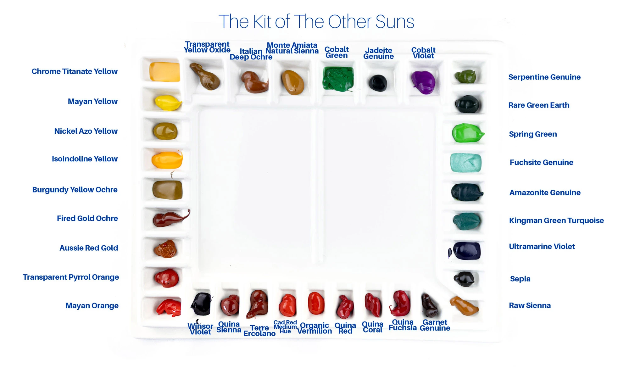
The Kit of the Other Suns, my third studio palette, with every pigment labeled.
The third palette is the "Kit of the Other Suns." With it, my studio now consists of three palettes and 99 pigments.
Instead of just squirting my pigments into the wells in a rough rainbow format, I spent days designing where everything was meant to go, paying attention to which pigments sit beside one another. Instead of creating a rainbow color wheel as I did my entire life, I decided that Burnt Sienna lives next to French Ultramarine because they mix constantly. Transparent Yellow sits beside Green Gold. Green Gold borders Perylene Green. The layout imitates my workflow.
Creating a Foolproof Reference Guide
Even an organized palette has one weakness. Months from now, I'll eventually forget where each pigment is.
So before using the palettes, I photographed them from directly above, labeled every pigment in Photoshop, printed the guide, and laminated it.
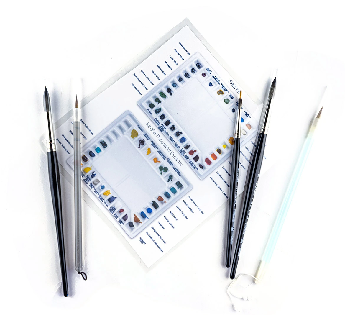
The laminated palette map: photographed from directly above, labeled in Photoshop, and laminated, so I can always look up where each pigment is.
Now I can glance at the reference sheet and immediately know where every color lives. The guide also solves another problem: future maintenance.
When a well finally empties, I know exactly which pigment belongs there. No guessing. No accidental rearranging. The organization remains permanent.
Instead of thinking about where the paint is, I can think about the painting itself.